Everyone knows candy is junk food. That’s kind of the point.
When you grab a Snickers bar, you’re not fooling yourself into thinking it’s a health food. You know exactly what you’re getting: sugar, chocolate, and peanuts, all packaged up in a delicious candy bar.
But what if candy companies wanted to change your perception? What if they wanted to tap into the massive health food market without actually changing their recipes?
Turns out, it would be incredibly easy.
I spend a lot of time on social media showing how brands manipulate perception through packaging and design. Usually that entails taking something that is traditionally viewed as “unhealthy” and rebranding it to sound like a healthy option.
And that’s exactly what we’re diving into here.

I took some of the most recognizable candies out there and turned them into products that look like they belong in the health food aisle. Reese’s became a protein snack. Skittles became sports fuel. Candy corn became an artisanal honey treat.
The results are pretty convincing. And slightly terrifying.
Because if I can make candy look healthy in a few hours, imagine what actual candy companies could do if they wanted to break into the wellness space.
The ingredients didn’t change. The macros didn’t change. Just the story the packaging tells you.
A Quick Note on Food Labeling
Before we dive into the examples, I should mention that candy labeling is a bit more regulated than the examples I’m going to be sharing. The FDA requires certain elements to be present on all food packaging, but these aren’t production-ready label designs.
For these mockups, I focused on the front-of-package design and messaging to show you how perception can be manipulated. I didn’t include every required element because I wanted to keep the focus on the psychological tricks rather than get bogged down in regulatory details.
Even with all those regulations, companies still have a lot of flexibility in how they present their products. The examples here use real ingredients and real claims that could technically be made about these products.
That’s what makes this so effective.
Just because a small detail might be left out (like the total weight of the product), that doesn’t mean that what is included should be shrugged off, because this is all very much based in reality.
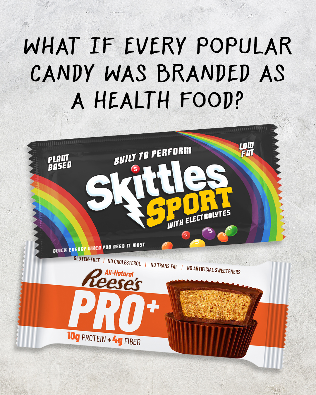
Turning Reese’s Cups into a High-Protein Candy (Reese’s Pro+)
Let’s start with probably the most believable transformation on this list.
I took the King Size Reese’s Big Cups and turned them into something that looks like it belongs next to the protein bars at GNC. It’s not even that much of a stretch.
The concept was simple: lean into the fact that peanut butter already has protein and make that the hero instead of the sugar and chocolate.
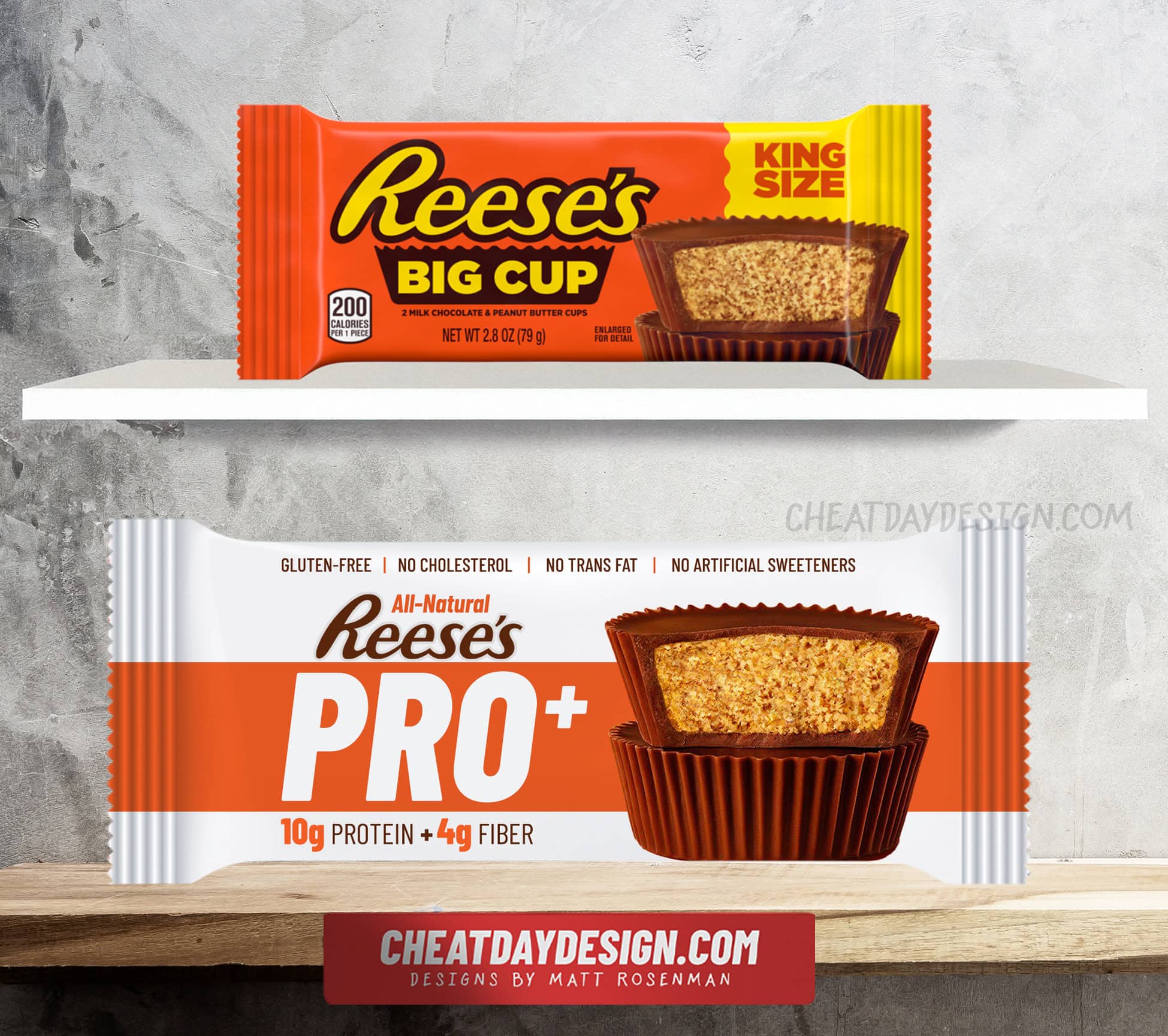
Here’s what I changed:
Swapped the iconic orange package for white with orange accents. White is the universal color of clean eating and wellness products. The orange stripe keeps it recognizably Reese’s while feeling more premium.
Renamed it “Reese’s Pro+.” Pro doesn’t technically mean anything, but your brain immediately thinks protein. The plus sign represents the fiber content (“plus fiber”), because adding a + to any product name makes it sound enhanced and functional.
Made protein and fiber the stars. The King Size version actually has 10g of protein and 4g of fiber. Not bad for candy… unless you consider the very high calorie content. We’re just not going to focus on that part.
Added “all-natural” everywhere. Reese’s technically uses natural flavors and nothing artificial, so this isn’t lying. It’s just strategically ignoring all the other stuff.
Loaded up on health buzzwords. Gluten-free, no cholesterol, no trans fat, no artificial sweeteners. All technically true, all completely irrelevant to whether this is healthy, but they make you feel better about eating it.
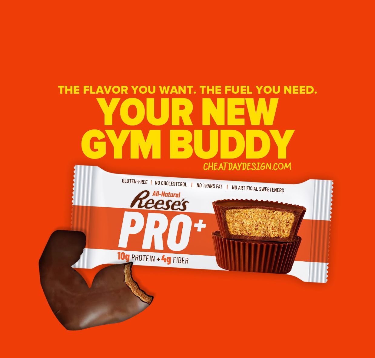
Positioning Reese’s as workout fuel is absurd, but the messaging works. “The flavor you want, the fuel you need” sounds like every protein bar commercial ever made.
Now you’ve got candy that feels like a post-workout snack instead of a guilty pleasure.
But it’s still just Reese’s. Same sugar content, same calories, same everything. I just made it sound like something your personal trainer would recommend.
And in a world that is extremely protein-obsessed, most of us would reach for this product without even thinking twice. And honestly, I would also fall into that camp.
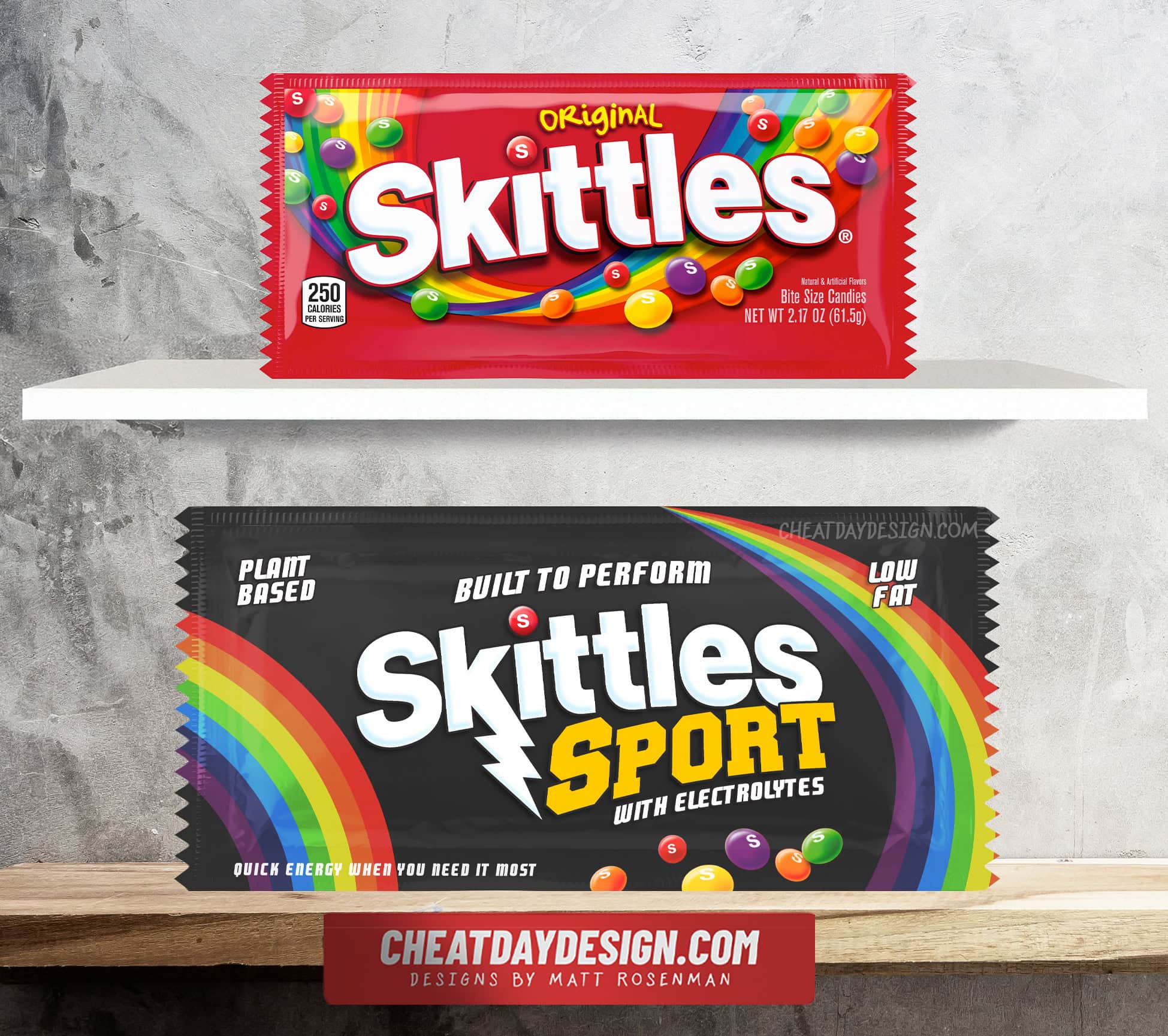
Turning Skittles into Sports Fuel (Skittles Sport)
For Skittles, rebranding requires a more unique approach. Whereas we can focus on the protein content for Reese’s, Skittles are essentially a mix of sugar and coloring, so there isn’t much to work with.
But, since sugar does indeed give you energy, we can lean into that.
For this one, we’re transforming Skittles into a premium energy source for elite athletes.
Here’s what I changed:
Completely flipped the color scheme. Instead of the bright red, rainbow-heavy package, I went with a black background that makes the rainbow colors pop even more. Black feels premium and performance-oriented.
Added a lightning bolt to the Skittles logo. Regular Skittles just aren’t energetic enough. The lightning bolt screams “power” and “speed” without saying anything specific, giving us some Gatorade vibes.
Renamed it “Skittles Sport.” Same candy, but now it’s positioned as functional fuel instead of a sugar rush. Using “sport” in the name lets the customer make assumptions about the product without any real claim.
“With electrolytes” became a key selling point. Skittles contain sodium, and sodium is an electrolyte. Technically true, completely misleading in context, but it’s something you’d want in an energy source.
Loaded up on sports buzzwords. “Built to perform” doesn’t mean anything specific, but it sounds like something an Olympic athlete would endorse. “Quick energy when you need it most” is just describing what sugar does, but it sounds way better.
Called out “plant-based” and “low fat.” Both technically accurate, both completely irrelevant to athletic performance, but they make it sound cleaner and healthier.
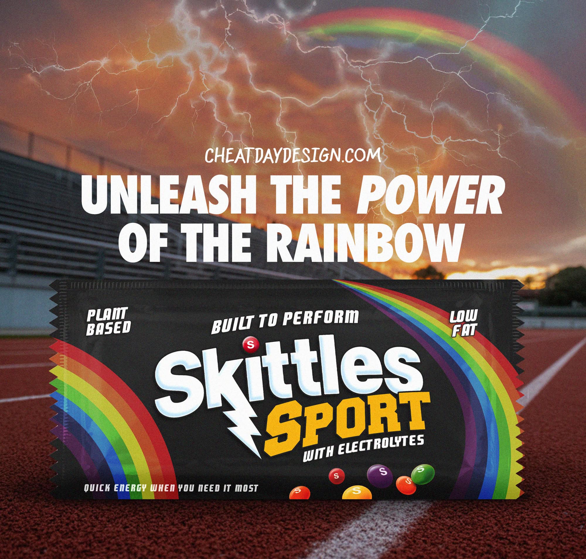
The fake ad tagline says it all: “Unleash the power of the rainbow.” It’s taking Skittles’ most recognizable slogan and making it sound like a pre-workout supplement.
After a little rebranding, you could easily picture this being sold at running stores or handed out during bike races.
But it’s still just Skittles. A little rebranding goes a long way.
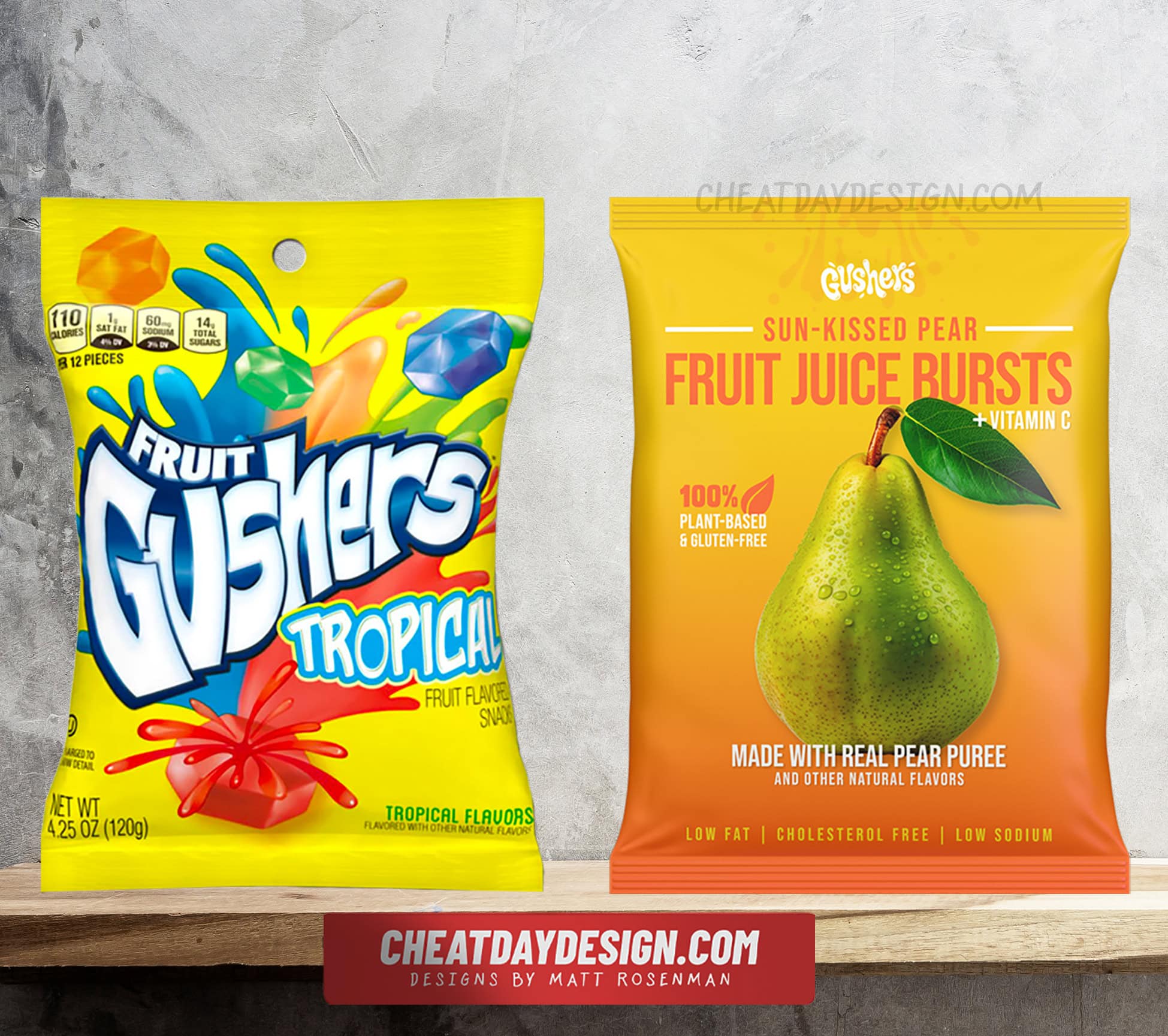
Turning Gushers into Clean Fruit Snacks (Fruit Juice Bursts)
I took Gushers – those neon-colored candies that explode with liquid sugar – and made them look like something you’d find in the organic section at Whole Foods.
The strategy was to focus on the fact that fruit is one of the main ingredients, and completely ignore pretty much everything else.
Here’s what I changed:
Renamed them “Fruit Juice Bursts.” Much more sophisticated than “Gushers.” It sounds like actual fruit instead of candy that happens to be fruit-flavored.
Made the Gushers logo way less prominent. You can still see it, but it’s not the focus anymore. You wouldn’t associate that logo with health, so it had to take a backseat.
Switched from exploding candy imagery to a real pear photo. Instead of cartoon Gushers bursting with liquid, you get a beautiful, fresh pear with water droplets. Complete perception flip.
Chose “sun-kissed pear” as the flavor name. Tropical Gushers actually list pear as the main ingredient after sugar, so this is technically accurate. “Sun-kissed” makes it sound premium and natural, but it means nothing.
Added a simple gradient background. Clean, minimal design instead of the chaotic cartoon explosion you usually see on Gushers packaging.
Highlighted “plus vitamin C.” Only 9mg, but it’s technically in there. Any vitamin content makes candy feel more nutritious.
Loaded up on the expected health claims. 100% plant-based, gluten-free, made with real pear puree, low fat, cholesterol-free.
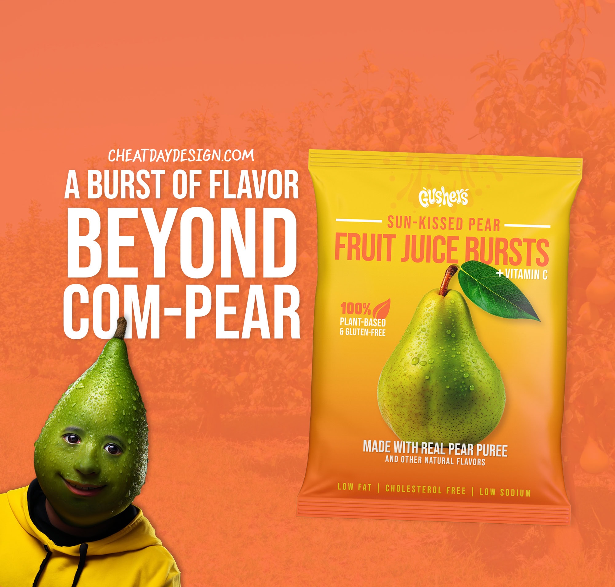
The result is something that looks like it belongs next to Annie’s fruit snacks instead of next to Sour Patch Kids.
But it’s still just Gushers. It’s the same sugar-loaded gooey candy that kids go crazy over. I just made it look like actual fruit.
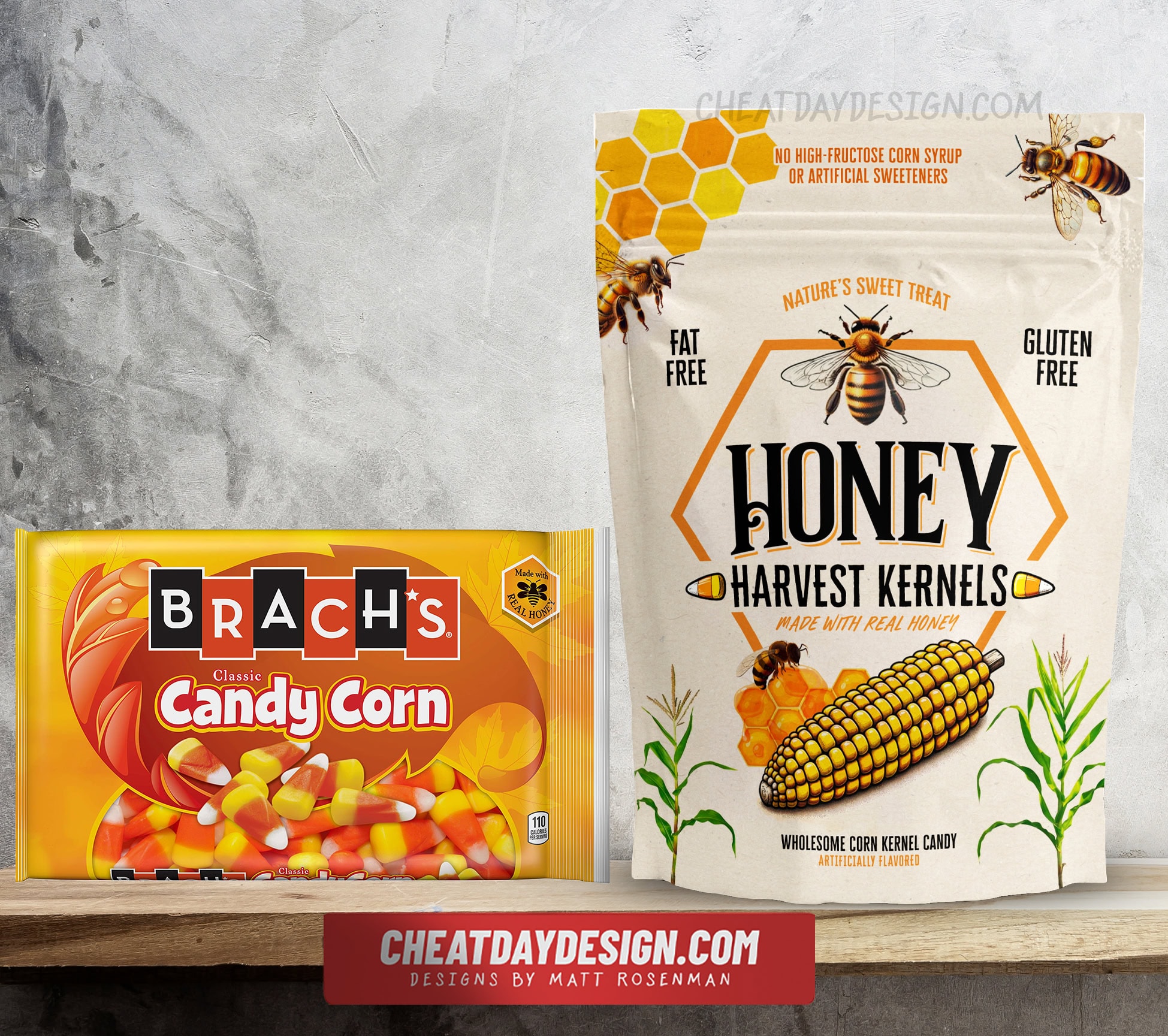
Turning Candy Corn into an Artisanal Honey Treat (Honey Harvest Kernels)
This rebrand tackles a unique challenge: taking something most people actively dislike and making it look not just healthy, but actually appealing.
Candy corn has a serious image problem. People either love it or think it’s the worst candy ever created. So this became an exercise in complete perception overhaul.
For what it’s worth, I love candy corn. I mean, it’s sugar, what’s not to love?
The strategy was to lean heavily into the honey content and make it feel like an artisanal, farm-fresh product.
Here’s what I changed:
Renamed it “Honey Harvest Kernels.” Much more sophisticated than “candy corn.” It sounds like something you’d buy at a farmer’s market instead of a gas station.
Went full rustic with the packaging design. Earthy colors, natural textures, and a kraft paper look that screams “handmade” and “small batch.”
Made bees the stars of the show. Bees and honeycomb imagery everywhere because candy corn actually does contain honey. Not much else that’s natural, but honey is legitimately in there.
Added corn stalk imagery for the aesthetic. We want to reinforce that “harvest” and farm-fresh feeling.
Used a full corn cob as the hero image. This is genius because when you stack candy corn pieces, they actually form the shape of a corn cob. Much more appealing to look at than individual candy pieces.
Called it “wholesome corn kernel candy.” You still know what you’re buying, but “wholesome” and “corn kernel” make it sound like actual food instead of processed sugar.
Highlighted the honey connection with “nature’s sweet treat.” Honey really is nature’s sweet treat. The tagline doesn’t claim that candy corn is natural, just plays with the association.
Added the usual health callouts. Fat-free, gluten-free, no high-fructose corn syrup, no artificial sweeteners. All technically true, and it ignores all the other sweeteners that are definitely in there.
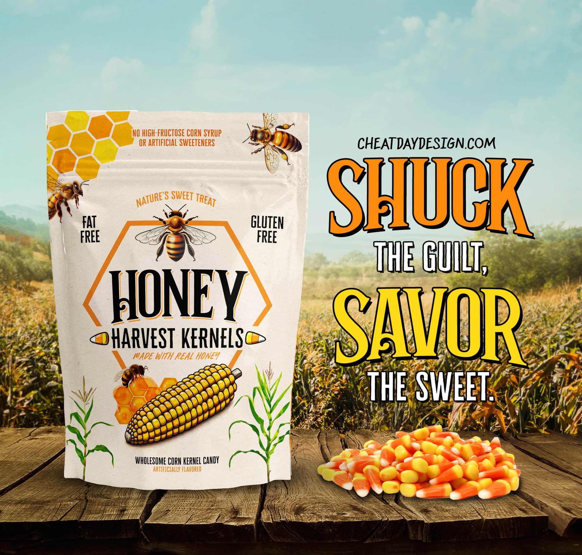
This label transformation is pretty dramatic. You’ve got candy that looks like it belongs at a boutique farm stand instead of the bottom of a Halloween bag.
Will it make people love candy corn? I guess we’ll never find out, but my guess is yes, absolutely.
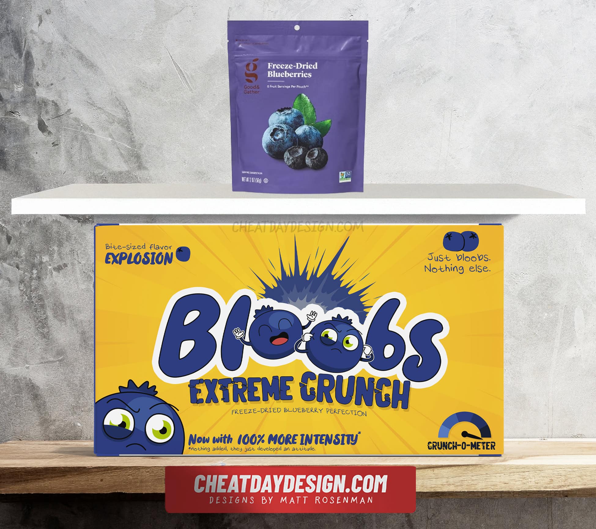
Turning Blueberries into Movie Theater Candy (Bloobs)
And now for the reverse psychology finale.
I took blueberries, literally one of the healthiest snacks you can eat, and made them look like the most intense candy you’d find at a movie theater.
The idea was to prove to you that packaging manipulation works both ways. If you can make junk food look healthy, you can definitely make health food look like junk.
For this one, I decided to rebrand freeze-dried blueberries, because you’re not going to find farm-fresh blueberries on shelves.
Here’s what I changed:
Gave them a ridiculous name: “Bloobs.” It sounds silly and fun, exactly what you’d expect from movie theater candy. You want something buzz-worthy, and I think “Bloobs” accomplishes that.
Created cartoon blueberry characters with attitude. These aren’t just fruits anymore, they’re characters with personalities. The mascot design makes them feel like a sugary cereal or candy brand.
Made the packaging bright yellow and chaotic. The complete opposite of the muted, natural colors you’d expect on healthy snacks. This screams “artificial” and “extreme.”
Added a “Crunch-O-Meter” for pure fun factor. Completely unnecessary but exactly the kind of gimmick you’d see on candy packaging.
Loaded up on intensity language. “Extreme crunch,” “bite-sized flavor explosion,” “100% more intensity.” All describing the natural properties of freeze-dried fruit, but in the most over-the-top way possible.
Included a cheeky disclaimer: “Just bloobs. Nothing else.” This is actually the most honest part of the package – they really are just blueberries. But it’s positioned like a joke instead of a health claim.
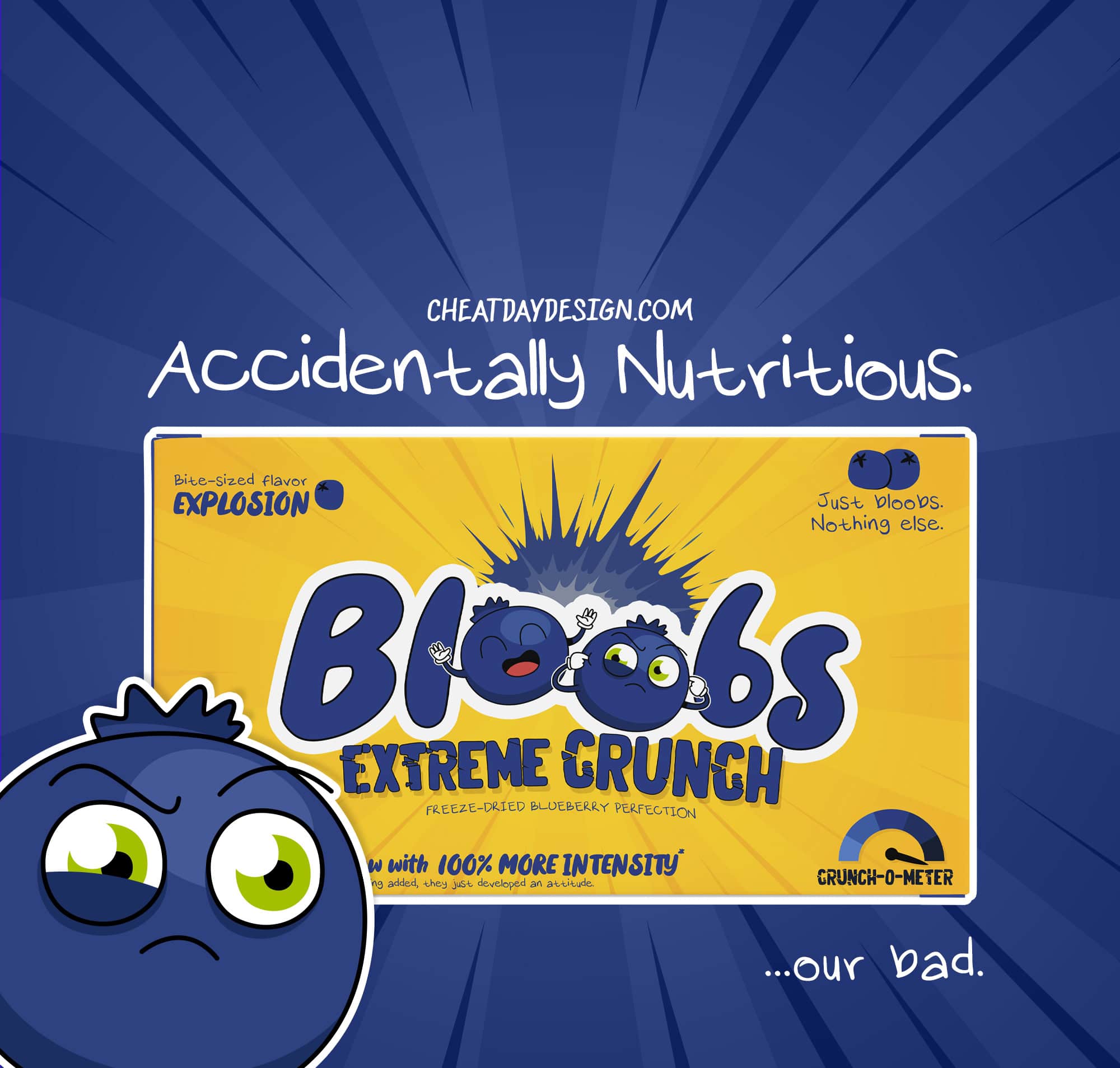
For an ad campaign, we’re using “Accidentally nutritious… our bad.” It’s acknowledging that these are actually healthy while apologizing for it to create a fun angle.
You could easily picture kids begging their parents for these in the candy aisle, having no idea they’re asking for fruit.
If you lean too heavily into what makes a product unhealthy, then nobody is going to want to buy it. Junk food branding mostly centers around fun, and that’s exactly what we have here.
The Packaging Tells the Story
Just by rebranding the labels, we completely changed the perception of the products without changing any of the ingredients.
Reese’s went from candy to gym fuel. Skittles became an athletic performance enhancer. Gushers turned into premium fruit snacks. Candy corn looked artisanal and farm-fresh. And healthy blueberries became extreme movie theater candy.
The transformation in each case is pretty dramatic. But nothing about the actual products changed.
This is exactly what’s already happening in grocery stores, just in the opposite direction. Walk down the “health food” aisle and you’ll find plenty of products that aren’t much different from candy. They just tell a better story through their packaging.
Energy bars with more sugar than Snickers. “Natural” fruit snacks that are basically gummy bears. Protein bars that could pass for dessert.
The difference isn’t what’s inside. It’s how the package makes you feel about what’s inside.
Candy companies haven’t done these rebrands because, honestly, they probably don’t need to. The market for guilt-free indulgence is already pretty crowded. But if they wanted to break into the wellness space tomorrow, the playbook is right there.
Change the colors, add some buzzwords, focus on the one semi-healthy ingredient, and boom. Premium health food.
Next time you’re shopping, take a second to look at some of the healthy candy options and see what is actually inside. In many cases, they may very well be healthier alternatives.
But sometimes the “healthy” option in the fancy package isn’t much different from the candy bar sitting three aisles over.