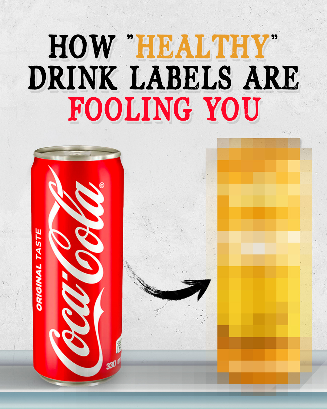
Walk into any grocery store and you’ll see “healthy” energy drinks, “hydrating” sodas, and “clean” beverages everywhere. But most of these products aren’t actually any different from regular soda or energy drinks.
They just look different.
The same companies that make Coke, Pepsi, and Monster could easily rebrand their existing products to look like wellness drinks without changing a single ingredient.
They’d just need new packaging, some buzzwords, and a clever new name.
Don’t believe me? I’ll show you exactly how easy it is.

I actually do this all the time on social media– taking products that everyone knows and rebranding them to show how marketing and packaging can completely change your perception of what something is.
In this case, I took five drinks that everybody knows and gave them complete makeovers. Regular Coke became a nature-inspired wellness drink. Pepsi turned into a hydration-focused beverage. Monster became a soft, clean energy option.
I even flipped it around and made plain water look like an extreme energy drink.
Nothing about the actual products changed. Same formulas, same ingredients, same everything. But I guarantee you’d perceive them completely differently just based on the packaging.
This isn’t some theoretical exercise. This is exactly how the beverage industry works. The “healthy” drink you picked up last week? There’s a good chance it’s not much different from the soda sitting right next to it.
Let me walk you through how this works.
Turning Coca-Cola Into a Wellness Soda (Thrive by Coke)
Let’s start with one of my favorite product rebrands I’ve ever done.
I took regular Coca-Cola and turned it into something that looks like it belongs in the health food aisle next to kombucha and organic juices.
The concept here was simple: make Coke feel like a premium wellness brand without changing anything about the actual formula.

Here’s what I changed:
Swapped the iconic red for gold. Gold feels premium, natural, and expensive. It’s the color of honey, sunshine, and luxury wellness products.
Renamed it “Thrive.” This isn’t Coca-Cola anymore. It’s a wellness sub-brand that happens to be made by Coke. Thrive sounds like something you’d buy at Whole Foods.
Called it “sparkling cola” instead of soda. Same drink, fancier name. Sparkling water is healthy, right?
Added “natural” everywhere. Coke technically uses natural flavors, so this isn’t lying. It’s definitely misleading when you’re dealing with high fructose corn syrup, but that can technically be considered “healthy” under current FDA guidelines.
Highlighted “100% plant-based.” You’d hope soda would be plant-based, but putting it front and center makes it sound like a conscious choice.
“Smooth energy” at the top. It has the same caffeine as regular Coke, but calling it “smooth energy” makes it sound like clean, sustained energy instead of a sugar rush.
Flavor name: “Caramel Gold Bliss.” Coke doesn’t have a specific flavor… it’s just Coke. But giving it a healthy-sounding flavor name can completely change a shopper’s perception.
Nature imagery everywhere. Those golden fields in the background exist purely for manipulation. Nothing says “natural” like rolling hills behind your HFCS.

While this now looks and sounds completely different, it is literally just Coke in different packaging.
I designed this and I know what it is, but I would still reach for this over regular Coke if I saw them side by side.
That’s how well this stuff works.
Let’s look at the same thing for Pepsi, but approaching it from a completely different angle.
Turning Pepsi Into a Hydration Drink (Pepsi Hydrate Plus)
For Pepsi, I went with a completely different approach. Instead of the warm, natural wellness vibe I gave Coke, I made Pepsi look like a hydrating beverage.
Think Liquid IV or those fancy electrolyte drinks… but it’s just regular Pepsi.

Here’s what I changed:
Sleek black and blue design. This screams “premium hydration product.” The blue obviously represents water, and the black gives it that high-end, minimalist look you see with expensive brands.
Put the Pepsi logo inside a water drop. Subtle but effective. Now Pepsi is associated with hydration, instead of just soda.
Called it “Hydrate Plus.” The “plus” is genius because it doesn’t mean anything specific. Plus what? Plus flavor? Plus electrolytes? Plus nothing? Doesn’t matter. It just sounds better, and it doesn’t need a specific meaning.
“Premium sparkling cola” instead of soda. Just a fancier way of saying “soda.”
“Main ingredient: always water.” This is technically true for every soda ever made, but when was the last time you thought about soda as mostly water? Putting this front and center completely reframes what you’re drinking.
“Smooth taste, clean energy.” Neither of these phrases mean anything concrete, but they sound healthy and refreshing.
Added all the obvious health callouts. Fat-free, gluten-free, low sodium. True for pretty much every soda, but listing them makes it feel like a conscious health choice.
“Naturally flavored.” Pepsi does use natural flavors, so while this is certainly misleading, it’s still technically true and allowed.

The fake ad really drives this home: “Where hydration and flavor fizz together.” It’s positioning Pepsi as a hydration solution that just happens to taste good.
But it’s still just Pepsi.
Same sugar, same everything. I just made it look like something you’d grab after a workout instead of with a burger.
Turning Monster Into a Clean Energy Drink (Monster Naturals)
For Monster, I wanted to see just how far I could push this. Monster is probably the most aggressive, in-your-face energy drink brand out there. Could I make it look calm and wellness-focused?
Turns out, yes. Pretty easily, too.

Here’s what I changed:
Softened the logo completely. Instead of the famous Monster claw marks, I turned the “M” into a heart shape. Same letter, totally different vibe. Now it feels like a brand that cares about your well-being.
Swapped black and neon for white and soft pastels. White is the universal color of “clean.” Add some gentle green and yellow, and suddenly this is something light and refreshing.
Called it “Monster Naturals.” Still Monster, but now it’s the healthy line that is technically natural.
Added fruit imagery everywhere. Apples and citrus make everything look natural and wholesome, even when you’re dealing with, well, an energy drink.
“Real ingredients, clean energy.” This is one of my favorite meaningless phrases. What are “real ingredients”? As opposed to fake ingredients? It sounds good, but says absolutely nothing.
“Rich in B-vitamins, with antioxidants.” Both of these are technically true for regular Monster, but highlighting them makes it sound like a health supplement.
“For the body and the mind.” This is pure marketing fluff. For the body, how? For the mind, how? Nobody asks because it sounds wellness-y enough.
Flavor name: “Sparkling Apple Citrus.” Monster doesn’t really have flavors, it just tastes like Monster. The real flavor is probably closer to lighter fluid, but giving it a fruit-forward name makes it feel fresh and natural.

The fake ad’s tagline says it all: “Not all monsters are scary.” They’re positioning the Monster brand as something friendly and approachable instead of extreme and aggressive.
But it’s still just Monster Energy.
Same caffeine content, same energy blend, same everything. I just made it look like something you might sip on a casual Sunday morning instead of something you were chugging back in High School.
Turning Four Loko Into A Premium Seltzer (Fourtify)
Okay, this one might be my most ridiculous rebrand yet.
Four Loko is literally famous for being dangerous (especially the original formula). It’s the drink that got banned from college campuses for sending people to the hospital. It’s aggressive, chaotic, and about as far from “wellness” as you can get.
So naturally, I turned it into something that looks like a premium seltzer you’d bring to a yoga retreat.

Here’s what I changed:
Kept the “Four” but made it “Fourtify.” This maintains brand recognition while adding a healthy twist. “Fortify” means to strengthen or enhance, so now it sounds like it’s good for you while staying true to the brand.
Swapped the chaotic camo design for clean white with subtle red accents. This looks like every trendy seltzer brand trying to appeal to health-conscious millennials (of which I am one of).
Added delicate cherry imagery. Fresh fruit always makes alcohol seem more sophisticated and natural. Think fancy cocktails with muddled berries.
Called it a “premium malt beverage infused with fruit flavor.” Same product, way fancier description. “Infused” makes it sound artisanal (which ironically also means virtually nothing).
Flavor name: “Fresh Cherry.” Fresh Cherry sounds like something from a farmer’s market, and it’s a very simple way to elevate a basic flavor.
“Energy + Antioxidants” at the top. Thanks to the caffeine and some creative interpretation of the guarana and taurine, we can technically claim these health benefits.
“Fat-free and vegan-friendly.” Both true, both irrelevant, both make it sound healthier.
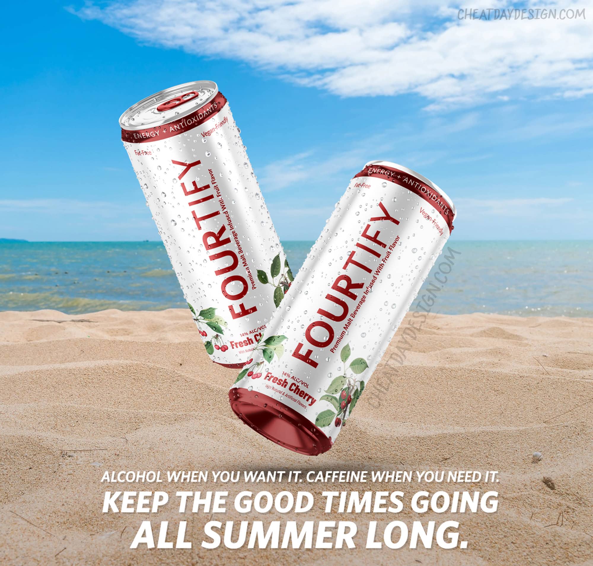
Now, Four Loko is an alcoholic energy drink that could easily sit next to White Claw, and nobody would think twice about it.
But it’s still Four Loko.
Same alcohol content, same caffeine, same formula that used to get people hospitalized. I just made it look like something responsible adults would drink at brunch.
If that doesn’t prove how powerful packaging is, I don’t know what does.
Turning Water Into an Energy Drink (H2Obliteration)
To close things out, I wanted to do something a little different. Since it’s clear that we can use branding to make something look healthier, can we also do the reverse?
Is it possible to take water, the most objectively healthy beverage on the planet, and make it look like a hardcore energy drink?
This is regular water. Literally just H2O. But I guarantee if you saw this in a gas station cooler, you’d think it was some hardcore energy drink with 400mg of caffeine.

Here’s what I changed:
Gave it an aggressive name: “H2Obliteration.” Energy drinks almost always sound threatening, so that’s the route we’re taking. This sounds like something you’d drink before storming a battlefield, not something you’d sip because you’re feeling dehydrated.
Added an intense gaming mascot. That little water creature looks like it escaped from a video game. It’s cute, but also looks like it wants to fight you. Perfect for an energy drink.
Black can with electric blue accents. The complete opposite of the clean, minimal look we associate with premium water. This screams “EXTREME SPORTS” and “DANGER.”
Flavor name: “Liquid Lightning.” It’s water. The flavor is water. But “Liquid Lightning” makes it sound like it’ll give you superpowers.
“Superior taste.” I personally think this water tastes superior because… well, it’s my water. There’s no regulation on that kind of claim, so I’m claiming it.
“High Octane H2O for rapid rehydration.” High octane water? What does that even mean? Nothing. But it sounds intense and performance-focused. And of course water will rapidly rehydrate you.
“Crisp. Cool. Charged.” Three words that mean absolutely nothing… but they sound cool together.

This is the perfect example of how packaging doesn’t just make unhealthy things look healthy. It can make the healthiest thing on earth look like something that would get you sent to the principal’s office for bringing into school.
Same H2O molecules. Same zero calories. Same complete lack of anything remotely dangerous.
I just made it look like it belongs next to Monster and Red Bull instead of next to Evian.
The power of branding can easily go both ways.
The Power of “Healthy” Branding
Five different drinks. Five completely different perceptions. Zero formula changes.

That Coke rebrand looks like something you’d find at Whole Foods. The Pepsi feels like a premium hydration product. Monster suddenly seems calm and natural. Four Loko looks responsible and healthy. And plain water appears dangerous and extreme.
But nothing actually changed except the packaging.
This isn’t some hypothetical exercise. This is exactly what happens in the beverage industry every single day. That “clean” energy drink you bought last week? There’s a good chance it’s not much different from a regular energy drink that costs half the price.
The “hydrating” soda that made you feel better about your choice? Still soda.
The “wellness” drink with natural ingredients? Probably has the same sugar content as a Coke.
I’m not saying you shouldn’t buy products that are marketed as healthy. In a lot of cases, they are actually healthier alternatives.
I’m just saying you should know what you’re actually buying. The fancy packaging, the wellness buzzwords, the clean design- none of that tells you anything about what’s inside the can.
Next time you’re in the beverage aisle, take a look past the packaging. Check the nutrition label. See what you’re actually getting.
Because if I can make Coke look like a health drink and water look like an energy drink in a few hours, imagine what companies with million-dollar marketing budgets can do.
The product doesn’t lie. But the packaging absolutely can.

